How the wind, rain and temperature are predicted and illustrated on charts for the television weather forecast.
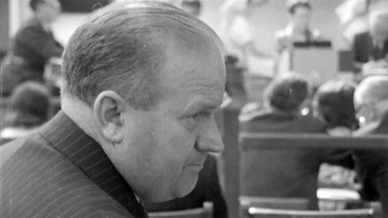
Meteorologist Seamus Miller explains how to predict the weather for Senior Geography students.
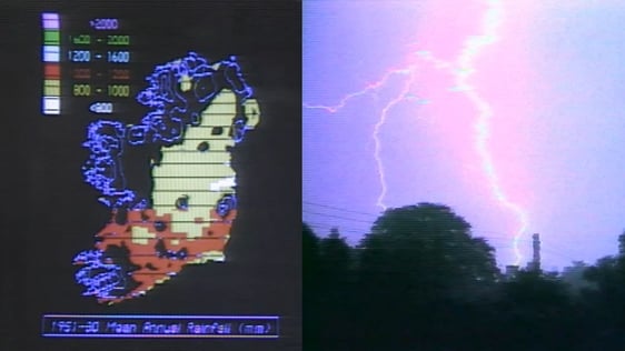
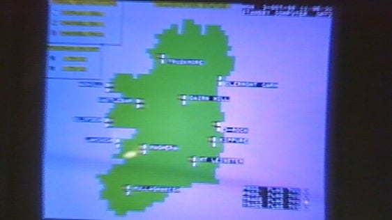
The maps presented on the television weather each evening are copies of maps prepared at the Central Forecast Office. There are two maps, one showing the actual weather conditions in terms of isobars, pressure systems and fronts each day, and the other is a forecast chart showing the same as they are expected to be on midnight of the following day.
Seamus Miller shows a typical day with information on the chart coming from hundreds of weather stations over Europe, Iceland, Greenland, the United States.
From this information, the chart is drawn.
In the example, he explains the location of the pressure zones, wind direction, warm and cold fronts, and air masses. The information is also presented on a satellite map from a photograph taken 700 miles up in space.
The forecaster's job now is first to predict how these various systems are changing and to translate, as it were, the changes in these systems into the weather changes which take place over Ireland.
The forecaster has a sequence of charts to guide predictions. These charts are prepared every three hours night and day. The forecaster also has a sequence of satellite pictures which show the cloud formation. The forecaster also has the valuable asset of drawing on experience of similar situations that have occurred in the past. All of this information feeds into the forecast.
And so the picture goes on changing from chart to chart giving us our rather variable weather, some good and some bad.
This episode of 'Telefís Scoile’ was broadcast on 15 March 1971. The presenter is Denis Mitchell.
'Telefís Scoile' was an educational television programme that gave school lessons in maths, science and literature. It was first broadcast on 4 February 1964 and continued throughout the 1960s and 1970s.