
Marathon becoming Snickers; WWF becoming WWE; Facebook becoming Meta.
Rebrands have, for many decades, been a common feature of business.
The reasons why businesses opt for a facelift can be many – and the process can be expensive, convoluted and controversial.
And, when all is said and done, there's no guarantee the public will buy into the change.
Why is rebranding so expensive?
We need your consent to load this rte-player contentWe use rte-player to manage extra content that can set cookies on your device and collect data about your activity. Please review their details and accept them to load the content.Manage Preferences
It’s the kind of thing that can take a lot of work – especially when you’re talking about big, multinational companies.
They’re likely to spend a lot of time workshopping their new name or look getting in lots of expensive consultants and doing lots of market research.
Then they have to check and make sure they’re not going to get sued by someone else who has been using that new name before. This requires a lot of legal legwork, and probably a lot of copyright and trademark filings around the world.
Then they have to actually rollout the rebrand – which means redesigning logos on websites and apps, on offices and equipment.
And after all of that they probably want people to know that they’ve changed their look, which means a decent amount of money spent on advertising and awareness campaigns.
Think of those ads where they say things like 'new look – same great service’, because they want to ensure old customers keep buying their goods, while they try to attract new ones in too.
Why do companies do it?
There are a multitude of reasons why a company might decide to rebrand.
In some cases it’s simply because they want to refresh or revitalise the company image. A good way of shaking of an old-fashioned reputation is to get a new look.
In the past many rebrands have happened to ‘globalise’ a product – so there is one name for it in every country, rather than different brands in different markets.
It could even be as simple a thing that the old name is too long-winded, so a rebrand lets them shorten it or change it to something snappier.
Or maybe they’re trying to emphasise a change in direction – like new product lines. Or perhaps de-emphasise something about the company that doesn’t play as well with the public as it used to.
Plenty of rebrands have taken place because the company name has become synonymous with something bad – and they essentially want to hide that connection.
What brands have changed name to shake off a negative image?
A lot of the time these are fairly quiet rebrands, because they company doesn’t want to draw attention to the fact that they’re trying to downplay a certain side of their business.
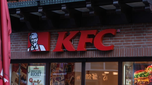
KFC is a good example of that – because it’s kind of changed its name without changing its name.
It, of course, was originally Kentucky Fried Chicken – but in the 90s it started to slowly emphasise its initials more and more, instead of its full name.
That’s because the company realised there was a growing, negative connotation around fried and deep-fried food – and it wanted to downplay that (without actually changing anything about the food itself or how it was cooked)
Today on their Irish website you will do well to find the word ‘fried’ anywhere – even in the descriptions of the fried food it sells.
Another company that switched to its initials in order to try to shake off a bad reputation is BP – originally British Petroleum.
By the early 2000s it had developed a really poor reputation around pollution, emissions and safety standards – so it rebranded.
Initially it became Beyond Petroleum, which it said was a nod towards its efforts to move away from fossil fuels and towards the likes of renewables.
It also ditched its shield logo for a green and yellow sunflower, which all looked very environmentally-friendly.
Eventually it dropped the "beyond petroleum" bit altogether and just went with BP.
Though, 20 years on, the vast majority of its revenue and profit still comes from fossil fuels rather than renewables.
Another company with a bad reputation was Philip Morris – the maker of cigarette brands like Benson and Hedges and Marlboro.
But its rebrand has been much more significant. It’s now called Altria; its website looks like something from a tech firm or a pharmaceutical,
Its company tagline is ‘Moving Beyond Smoking’ and it talks a lot about helping people to become "smoke free".
It still owns many of the biggest cigarette brands in the world – but it also has chewing and dipping tobacco brands, and investments in vape companies too.
So it's still focused on nicotine – but no longer under the name Philip Morris.
What about the companies trying to change direction?
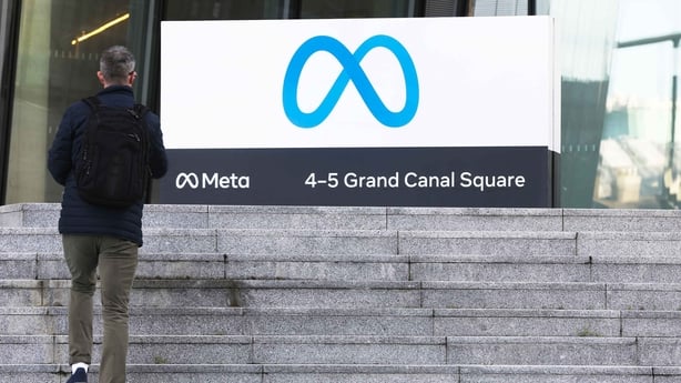
Facebook is a good example of that – it changed to Meta in late 2021; which it said was to emphasise its focus on the ‘metaverse’; the virtual reality world that Mark Zuckerberg would be the future of its business.
And it’s put a huge amount of money behind that – not just the rebrand itself, but investing in that metaverse future… its Reality Labs division lost $13.7 billion last year alone.
Some would say that the rebrand was also part of trying to shake off a poor reputation, given that it came on the back of multiple scandals; including Cambridge Analytica’s unauthorised gathering of user data, accusations of inaction around hate speech and offensive content, Russian interference in the US election and so on.
But of course the Facebook brand still exists – that’s still what the social network itself is called - and Meta also owns Instagram and WhatsApp.
So in cases where there are multiple brands, it’s not unusual for the parent company to have a different name altogether; Google did that years ago when its parent company changed its name to Alphabet.
It’s probably too early to say whether the change to Meta was a success or not – the company is still making billions in profits but there are a lot of questions about whether the metaverse future Zuckerberg is betting on will actually be something people want.
And a lot of people wouldn’t know what you were talking about if you mentioned Meta (just like they might not know what you were talking about if you mentioned Alphabet).
Elsewhere, there are plenty of examples of other companies trying to push out a new name to signal a change in direction – only for the public to reject it.
About 14 years ago Pizza Hut tried to rebrand itself as ‘The Hut’ in the US, because it wanted to highlight the fact that it made other food besides pizza, like pasta and salads. It also tried out ‘Pasta Hut’ at some of its UK stores.
But it quickly rolled back on the change because customers hated it – its parent company Yum Foods claimed it was just a trial.
Then there was the rebrand of the UK’s Royal Mail in 2001. Its management felt the name was old-fashioned – and didn’t reflect the fact that it had international operations, including logistics and call centre businesses.
And so it spent £2m changing to Consignia.
But pretty much everyone hated it and - around a year and a half later - it changed its name back to Royal Mail.
Do rebrands ever help a company’s image?
They generally work best when they simplify the brand image – and perhaps the best examples are companies that changed their name before they were particularly well-known.
Google, in its very early stages, was called BackRub – which is a terrible name.
But they realised that early on and changed to Google.
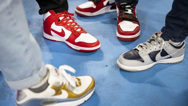
Nike was initially Blue Ribbon Sports – but changed its name after a few years, introducing the swish logo at the same time. That caught on and eventually made it a household name.
Simplification works well, too.
Pete’s Super Submarines started up in the mid-60s, but three years later became Pete’s Subs, then two years after that it was rebranded as Pete’s Subway, and then another two years later it changed to simply Subway.
International Business Machines has generally gone by IBM for decades.
GlaxoSmithKline is also now officially known as GSK – which is an easy rebrand, because most people were already calling it that anyway.
And even with companies that are keeping their name, but changing the ‘look’ of their brand – simplification is a popular trend at the moment.
People will probably have noticed a lot of company logos and brand names changing to a more minimalist, flatter design. And there are a couple of reasons for that.
Firstly, branding trends in the early 2000s and into the 2010s were around complex and colourful images. The design trends that follow tend to be a reaction to the last, so if you want your brand to stand out from the norm, you go the other way.
But there’s also a more practical reason – and that’s the fact that brands are designing their logos to work in all sorts of places – from big billboards through to small smartphone screens.
So in order to make sure your logo is legible even when it’s on a tiny little avatar on your Instagram or Twitter account, you need to make it simple, and clean.
But you can over-simplify, too…
Absolutely.
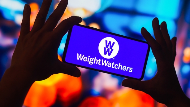
Back in 2018 Weight Watchers decided to rebrand for some of the reasons already mentioned.
The company was founded in the 60s and it has developed a bit of a stale reputation with consumers.
And its approach to weight-loss was also seen to be increasingly out of step with the market – which had shifted towards a focus on whole and healthy foods and ‘wellness’ instead of a focus on weight-loss alone, often through heavily-processed, low-calorie ready meals.
So it changed its name, simply, to WW… which it said represented ‘wellness that works’. But it’s so stripped back that it’s kind of meaningless.
And, of course, Weight Watchers – or WW – has since pulled back from a number of markets, including Ireland.
Since 2018 its revenues have fallen by around 33% – and last year it made a $283 million loss… so clearly the rebrand hasn’t had quite the effect that it had hoped for.
How do Irish firms fare when it comes to rebranding?
We’ve had lots of rebrands in recent years – particularly in the dairy sector.
And they really love to use Irish words in their names; which can create a bit of confusion.
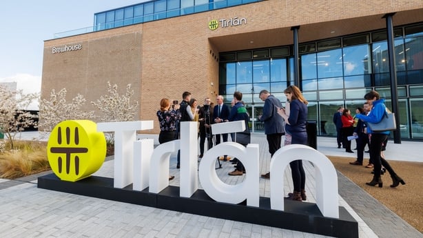
Glanbia, for example, was created in the late 90s when Avonmore Foods and Waterford Foods merged.
The name coming from ‘glan’ and ‘bia’ – clean food – but because it’s a big company internationally, and the name generally appears in the context of the English language, a lot of people probably think its pronounced ‘glann-bia’, or even ‘Glann-bye-ah’.
Last year it sold off its Irish consumer goods to the Glanbia Co-Op – but because Glanbia still exists, the new entity had to rebrand as part of the deal.
They came up with Tirlán – coming from ‘tír’, or land – and ‘lán’, or full.
Except it only used one fada in its name – over the ‘a’ – leaving the one over the ‘i’ out.
It said it did so to simplify the name and "make it more relevant in a global context", because it exports to 80 countries around the world.
But it kept in one fada as "a distinct Irish reference".
It should be said that the old Irish Dairy Board also omitted the fada when it changed its name to Ornua back in 2015.
The name comes from the Irish for New Gold, so technically there should be a fada over the ‘o’, but there isn’t.
Of course it’s not just dairy companies that have struggled when it comes to Irish name origins.
The family and child agency Tusla took its inspiration from the words Tús and Lá – or new day/beginning.
But it didn’t bring any fadas with it – it’s essentially made up a new word altogether – which has created confusion about how it should be pronounced.
Some people have even made the (understandable) mistake of thinking it has the same name as a city in Oklahoma.


