
Pantone Colours of the Year are an unusual cultural event: part social commentary, part aesthetic statement and fully a marketing stroke of genius, it's the kind of announcement that delights many and baffles the same. More often than not, it passes people by.
But the process of selecting the Colour of the Year is a fascinating one, and does have the potential to shift our perspectives on our lives. After all, our lives are in Technicolor, not black and white and as everything from politics to history has shown, colour has a language of its own.
Speaking to Glamour magazine in 2014, Leatrice Eiseman, Executive Director of the Pantone Color Institute, said that when it comes to pinpointing what colour is organically dominating culture, much of it is defined by fashion, at least initially.
"We also have to justify naming a color by seeing it in other places as well. We look at new films coming up. What colors are being used? Is there a new effect being used?" she added. "We look at the art world. Is there a collection of art that's being shown? Is it traveling the world and going to get a lot of publicity? Will people be influenced by that?"
Everything from the shade of lipstick used in a runway show to the finish on a car can hint towards what colours we are gravitating towards in how we express ourselves.
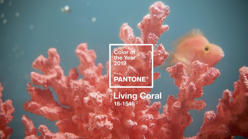
So what does this year's choice say about us? "Living Coral" is described as "an animating and life-affirming shade of orange with a golden undertone", and intended to be a counter to the "onslaught of digital technology and social media increasingly embedding into daily life", according to a Pantone press release.
It's an idealistic and romantic shade in sharp contrast to the year of political, social and environmental devastation the world has seen - and in this sense, the choice seems to be optimistic, aspirational, pointing us to ways of better thinking.
David Kastan, George M. Bodman Professor of English at Yale University and author of On Color, an academic study of colour through the ages, sees the double entendre in the colour choice.
"I take it that they wanted a comforting, warm colour this year (no doubt to counteract our unwelcoming and cold political world)", he told RTÉ Lifestyle, "and 'Living Colour' seems hopeful, if implausibly so, as coral reefs are dying and being bleached by warming seas and pollution. Probably half of the world's coral has died in the last fifty years."
Adele Roche, a renowned colour and design consultant, interprets it as an uplifting but clear caution of change: "For me, it's a bubbly colour, full of fun and high energy. However, orange is the colour of change and for anyone who fears change or finds difficult to make decisions this colour may be too scary."
She explains how colour, like sound, can have a marked effect on the body, so colour choices are not purely aesthetic. "Colours, like sound travel, on frequency: reds, oranges and yellows are on a longer frequency and will stimulate and excite us - they can increase our heart rate - and feel warmer, while cooler colours on the visual spectrum are calmer and will soothe and relax us."
Sally Augustin, PhD, a practising environmental/design psychologist and principal of Design With Science, agrees, saying "I think that this colour indicates that those who selected it, feel that society needs a 'burst of energy'".
If life turns on a colour wheel, then, where does "Living Colour" place us? "Society is constantly changing and evolving all the time", Roche says. "And the world is in a state of flux where we are becoming more aware of the importance of protecting our environment and changing our daily habits." She suggests that the choice of a warm-toned orangey-pink "resonates of rejuvenation".
For Kastan, his interpretation is decidedly more scepticall: "It says to me that Pantone has brilliantly made a new name for a colour (and a standardized paint that they sell) a news item. That is good marketing."
"But the colour has always been there—somewhere between orange and red (and there are an infinite number of minute gradations in that "between"), but no one had thought to name it. Artists had mixed it, however; look at any number of Bellini’s paintings."
Indeed, as he notes, coral has existed as a colour in English for centuries. "By the late 14th century it was recognized a shade of red (from coral that was found in the Red Sea), and Shakespeare, for example, several times refers to "coral lips" or a "sweet coral mouth."
Regardless, colour is a vital part of society, whether we like it or not. He explains the breadth of colour in society, saying "We colour code race, with colours no one actually is; our psychological states are colored: we are tickled pink and green with envy. We colour code gender, dressing girls in pink and boys in blue (though once it was the other way around).
"Social classes have colours: Blue-bloods and rednecks. And we colour code politics: e.g., the polarized blue states and red states in the US, and Green parties almost everywhere."
In a practical sense, it's an incredibly popular shade in beauty, fashion and interior design as it is. Roche advises using it "in social areas with its high energy and fun properties keeping people stimulated in both conversation and creativity". When combined with "deep, rich contrasts, dark earthy greens, browns, sophisticated navies" she says "it will energise any room that has rich darker browner wood flooring and furniture".
Living up to the "edge" Pantone advertised it as possessing, Roche cautions against using the shade liberally "as it is demanding on the eyes and might irritate both visually and mentally".
But as it is the fount from whence much of the inspiration for Colours of the Year emerge, we see the shade most often in fashion. Paul Costelloe, the esteemed Irish American designer, has been using the colour for years. Speaking to RTÉ Lifestyle, Costelloe defined the colour as "soft, feminine, not aggressive, it’s kind, it’s easy, it’s young and all these things are relevant".
"It’s nice for the moment, there’s so much aggression out there and it plays some soft part in our lives."
Aside from the aesthetic qualities of the shade, there's no grand symbolism to his use of it, despite what Pantone's rhetoric might have you believe. "I don’t want to use the word but there’s so much rubbish in fashion, it’s all completely overexaggerated", he says.
"The reason I’ve got it in my colour story is because I work with very good Italian mills who are always up to the minute with their colours. And probably Pantone looks at their fabrics. Companies like Mantero, who are leaders in the fashion industry."
It's worth noting that the colours chosen as Colour of the Year are preexisting in the Pantone catalog so it's a matter of matching their collection to what they observe in the world, with some new finishes added in. And while it can be easy to be swayed by the poetic interjection of one colour into our lives at one point, Augustin asserts that as colour is so instrumental in our wellbeing, we must be selective with which ones we choose to surround ourselves with.
As she says: "I think that people should always select colours that optimize their mood and align their mental state with the task at hand. They also need to choose ones that they link positively to prior life experiences."