The Irish Times reported over the weekend that An Post was to spend €5m on a brand refresh - which will see everything from its logo to its colour scheme, to the font it uses in its marketing - change.
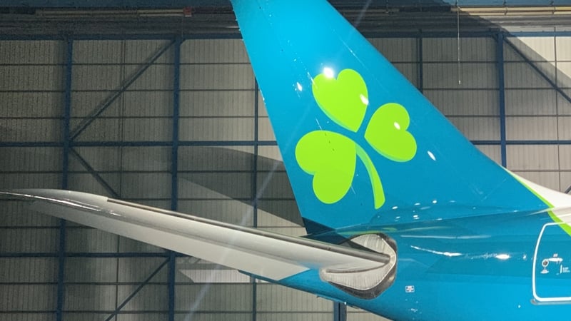
This follows hot on the heels of a multimillion euro refresh from another iconic Irish brand, with Aer Lingus also revealing an updated image last month.
While a rebrand can often be about a company shaking off an old image, or declaring a change in direction, a brand refresh can be a more subtle undertaking.
Mary Lambkin, professor of marketing at the UCD School of Business, said that a rebrand and a brand refresh are really just matters of degree.
"Sometimes when we do a rebrand you might actually change the name as well as the look of the product that you're representing, where as a brand refresh you're talking about continuity - you're talking about trying to update the brand logo and design that you've had already but to give it a more modern look," she said.
We need your consent to load this rte-player contentWe use rte-player to manage extra content that can set cookies on your device and collect data about your activity. Please review their details and accept them to load the content.Manage Preferences
Professor Lambkin also said the reports of millions being spend on these kinds of undertakings can also be over-done, and not necessarily representative of an additional spend on the part of the company.
The design work itself, she says, is usually relatively cheap. But the roll-out - perhaps involving a new look for a fleet of vehicles or in-store changes - is where the cost incurred. That is why many firms time their brand changes carefully.
"What they tend to do is tie it in with their normal cycle of refurbishment," she said. "So if you replace your vans or trucks on a three or five year cycle you wait until the next time they're being replaced, and you gradually rollout the new design.
"So you're not really incurring costs that you wouldn't have had anyway - you're just timing it so that you eventually end up with everything with the new look."
Professor Lambkin also feels the aspirational intentions that accompany a brand refresh do trickle down to the consumer - even if they don't realise the impact the new design is having on their opinion of a firm. However there are pitfalls in undertaking such a move - and the initial reaction to any rebrand can often be negative.
"We're all resistant to change and we're comfortable with what we're used to seeing. So when some new design or logo comes out we all have opinions about it and very often there will be negative opinions," Professor Lambkin said. "I think what you need to do is leave it for six months until we've all forgotten and it settles in and that negativity goes away."
For a handful of firms, though, that negativity lingered - with Aer Lingus' stablemate British Airways in IAG being a good example.
"British Airways decided quite a while ago that they were too British. They were seen as a British airline with global operations and they wanted to reverse that," she said. "They brought in this new design, which they called World Images, which was not one design but 50 designs - a suite of images of global cultures.
"But when they applied that to their tailfins it ended up in such total chaos - nobody could actually recognise them as British Airways at all - it's known as an iconic brand disaster," the Professor said.