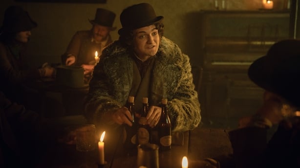
Netflix's latest hit show, House of Guinness, explores a story inspired by one of Europe's most famous and enduring dynasties - the Guinness Family.
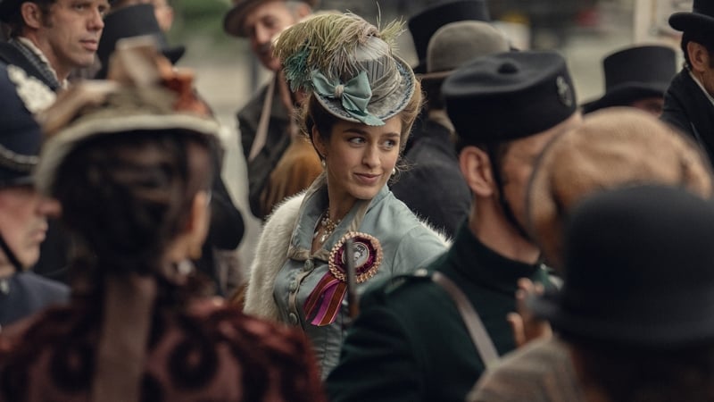
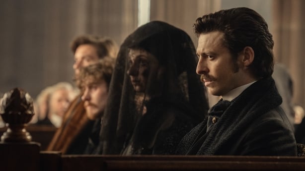
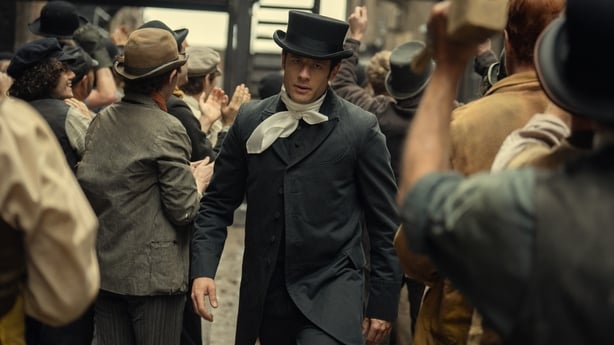
Set across 19th-century Dublin and New York, the star-studded cast were dressed in a stunning array of outfits, ranging from historically accurate mourning dresses to scandalous corsets.
With the series now available to watch, the streamer has shared its Q&A with costume designer Edward K Gibbon and associate costume designer Nadine Clifford.
Q&A with Edward K Gibbon - Costume Designer
Q: Was there a character you were especially excited to design for?
I think Christine, right from the word go, was a really interesting one. I’d only read two or three scripts, and she sort of appears as this quite punky, outsidery, vaguely messed-up person — and I just thought she was fascinating. Even just from reading those first two scripts, the characters were already so brilliantly sketched out that I had very clear visions of them in my head.
Q: What was your process for researching and approaching the designs — especially the textures, styles and colour palettes?
In terms of the research, obviously, because I’m quite old and I’ve done quite a few jobs, I’ve worked on things set in or around this period before — so I’m pretty familiar with the fashion history of the time. I still did more research on that front, but what was even more fascinating on this job was that it’s set in Ireland, and you don’t often see Ireland at this particular period.
We represented so many different aspects of class — from the villages in Cloonboo and the impact of the famine and politics to the very upper-class, very wealthy Guinness family. So, there were loads of different strata to go down in terms of research.
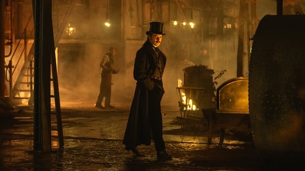
It was really interesting learning more about the brewery — who worked there, how it operated. And you can tell, especially from Steven’s writing, that the brewery is this iconic place. We knew from early on that we wanted to really establish this whole world of industry on the cusp of major expansion.
I’m always conscious of not repeating what’s been done before — or what I’ve done before — because I’ve got quite a short attention span. So I’m always looking for a new angle. And on this one, it was really about creating something that felt new.
Tom Shankland was very into this idea too — that the brewery shouldn’t feel like the grim "olden days" where everyone’s poor and has no shoes at the mill. Instead, we wanted the brewery to feel sexy — a powerful world of industry and money, but also one that’s philanthropic and charitable. That combination was interesting, and we really wanted to capture that identity.
We did a lot of research into different kinds of workers and uniforms from all over the world — how people dressed and what specific colour palettes we could use. That was a big part of the visual research, especially because Steven’s writing was very explicit about the use of black and white and colours inspired by Guinness itself.
We explored how black isn’t just black — there are a million different shades in it. Even within Guinness, there are brilliant tones of reds, greens, and golds. We brought all of that in. That was our twist — instead of presenting the past through sepia tones where everyone looks muddy and poor, we wanted flashes of colour and texture that brought the world to life.
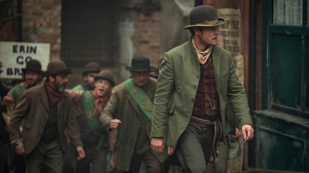
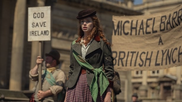
We contrasted that with the other worlds in the show — and that required even more research, especially into Irish history and clothing. The world of the Fenians, for example, as a British person, we’re not really taught much Irish history. It’s kind of wiped out. So it was fascinating to even dip a toe into that.
Again, we didn’t want to present them as a poor, angry rabble. We wanted to give them pride and identity. That was really important to us, and hopefully, that comes through on screen.
Q: Let’s talk about how that plays out in the Guinness family’s costume. What kind of detailing reflects their social standing?
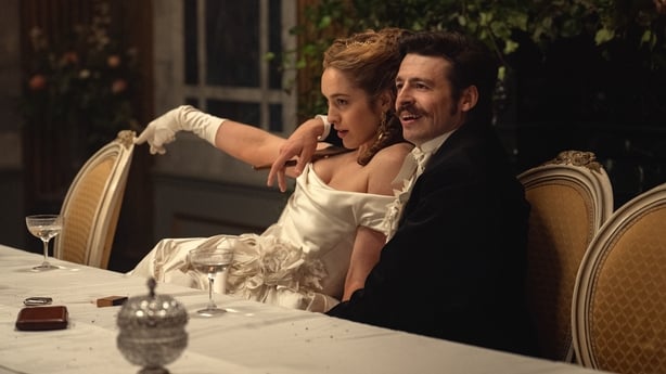
They’re comfortable in their wealth — our lot. They’re not really flaunting it because they don’t need to. They’re so used to having money, it’s just their normal. So that was interesting. And then within the family, you’ve got contrast — especially between the brothers and how they each approach clothes.
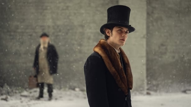
We leaned into Edward — we actually found one of the only existing photos of the real Edward at the age our character is, and he’s got this massive top hat, and this little baby face. He looks like a kid wearing his dad’s clothes. That became the key to him — he’s trying to be the sensible one, very much in his father’s shadow, still living at home.
Q: Let’s talk about the weddings — Arthur and Olivia, Edward and Adelaide. What was the process like designing for those?
The thing with the two weddings is that they’re both very different, and the characters are very, very different. So it was really interesting approaching them from different points of view. With Danielle’s Olivia, there was never going to be anyone else’s wedding but hers. And because of her character, she was the one who set the theme entirely. She made sure everyone came dressed how she wanted.
We’d already established Olivia as someone who lives in this fantasy world — a bit like Marie Antoinette at Versailles — everything’s pink and pastoral and fluffy. And that was kind of playing against the slightly calculating nature of her character, which made it fun. We really leaned into that — she has footmen in pink velvet and ruffles at her house — so the wedding just extended that aesthetic.
She was obviously going to be in ivory, and no one else was. Everyone else wore pastels, so she immediately stood out. There was this feeling that she was a goddess for the day, and we were putting her on a pedestal. Her dress was all about draping — it almost looked like she was falling out of it. The bodice just barely touched her skin, and it felt very much like the way Danielle plays Olivia — sexy but very in control, in a slightly scary way.
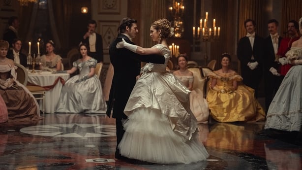
With the skirt, we kept adding more and more — Danielle was like, "Another layer!" She just wanted to be this massive, dramatic figure. Instead of giving her a bouquet, we put flowers on the dress — our brilliant team made these handmade silk flowers that draped down the gown. Anthony had a matching sprig of silk flowers on his tailcoat, so everything was coordinated. It was all very much Olivia’s vision — she stage-managed the entire thing. It was over the top, but beautiful.
It’s always special to make a wedding dress, and Danielle was so touched. There was a moment where it really felt like we were making her real wedding dress — we were all crying, and she said, "I can’t wait for my mum to see this." It was lovely. And then, of course, she wears it and gets on with it. There’s this brilliant shot where Anthony is just trying to push this big, fluffy thing out of the way!
The other wedding — Adelaide’s — felt very different. Adelaide is a much more modern character in our story. Although Olivia is also quite modern, she plays by the rules a bit more and accepts the terrible lot of being a woman with no power. Adelaide refuses to do that — she’s determined to be the one with power.
We’d also moved three years forward in history by that point, and the silhouette had evolved slightly. So we pushed her look a little more forward.
Adelaide wore a slimmer, more strictly tailored costume that reflected how we’d dressed her throughout — riding habits, waistcoats, masculine tailoring. Still beautiful, still cream, still very classy — but minimal in detail. The dress was all about the perfect cut and fit.
And while there was a slight theme among the guests at Adelaide’s wedding, it wasn’t nearly as rigorous or controlled as Olivia’s.
Q: What’s a detail you’re most proud of — something subtle but meaningful?
The things we’re probably most proud of are the ones we’ve made from scratch — and we’ve made an awful lot on this, which is rare nowadays. It’s been brilliant to have that opportunity, and we’ve had incredible tailors and an amazing workroom.
Ellen’s character, Cochrane, James — all of that was built. We’ve made pieces for everyone, really. Those are the things that really stand out. And for me, it’s when you’re suddenly out in the Welsh countryside — or in Skipton, where we were — and Adelaide’s on a horse in this incredible riding outfit we’ve made. It just looks beautiful.
Q&A with Nadine Clifford - Associate Costume Designer
Q: Is there a detail or costume you're especially proud of — something audiences might not notice, but that really added to the character?
There are so many! Rafferty’s medals, for instance, are so considered. Christine’s dagger was another one. It’s quite big — not subtle — but it always sat on her costume and gave her this mix of strength and unpredictability. We had time with the actors to find those details together, which made a big difference. Dervla (Agnes) was another highlight — she really embraced the fittings.
Q: What about the New York sequences — particularly Byron’s world?
For New York, Edward did some brilliant boards. We focused on bringing in as much colour and ethnicity as possible while staying true to the period. It was exciting to push the look. You could be a purist and say "no one would have worn that then," but we found actual images that proved otherwise — and those sparked really fun ideas.
We looked at who was in New York at that time, the jobs they did, and what fabrics they wore. For winter scenes, we used a lot of fur, including massive coats that made the guys look like teddy bears — topped off with little bowler hats.
It was about playing with proportion and silhouette to contrast with the women of Dublin. And yeah, it really felt like the Wild West — with cowboy hats, leather, and lots of texture. There were even scenes of Byron running through tenement districts, with sunlight casting silhouettes. You might not see every costume detail, but you feel it in the atmosphere. That was really exciting.
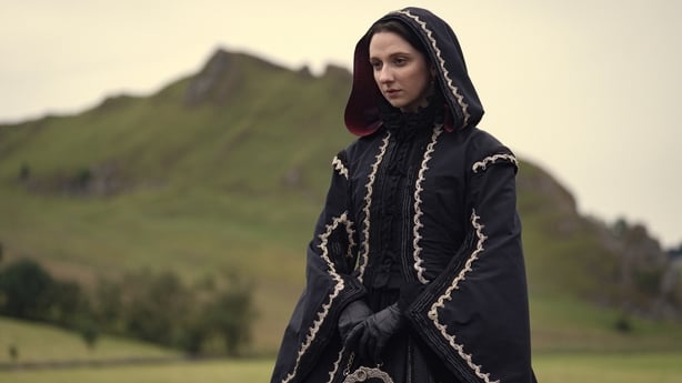
Q: Let’s talk about Dervla’s costume — and those sunglasses.
We love Dervla! She was obsessed — in the best way — with everything we gave her.
During an early fitting, we had these amazing Victorian diamond-shaped sunglasses. She wore them to the funeral — her first scene — and she used them so cleverly. There’s one moment where Arthur throws her a look, and she plays it with such subtlety — the glasses become this character moment. Anthony really responded to what she was doing with them. It was fab.
Q: Any final notes on the early research process and Edward’s boards?
Edward’s mood boards were the start of everything — full of paintings, photography, and sketches. What’s interesting is that we’re always doing a "period" version of a period. Like now, we’re reinterpreting the 1800s through our 2020s lens — just like the 1990s had its own version of Victorian style.
It’s fascinating how those echoes appear — corsets, top hats, all being reimagined. Those boards gave us the visual language to build from.